Cadence 3 Rebrand
Cadence 3 is a strategy-first agency focused on providing marketing, event experiences and design to the B2B technology sector. In-order to project an evolved, modern brand, Cadence 3 needed to modernize its visual identity without stepping too far from the originally identification purpose and established association.
I worked from an external rebrand effort, finding geometry relation errors and complexities that created master logo problems when trying to extend the initial geometry into logo style systems.
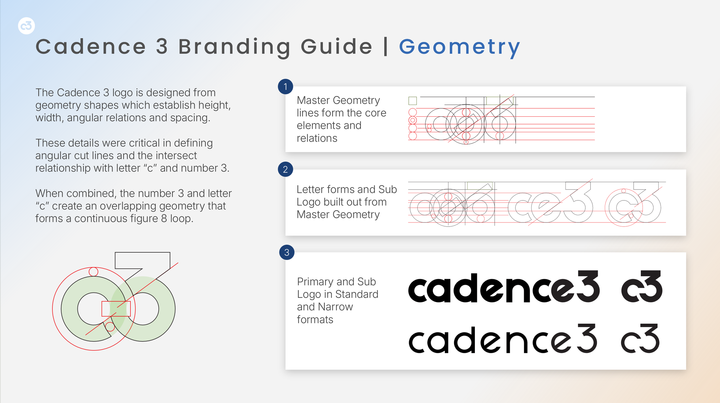
It is essential that a brand’s foundational geometry sets the framework for a complete system.
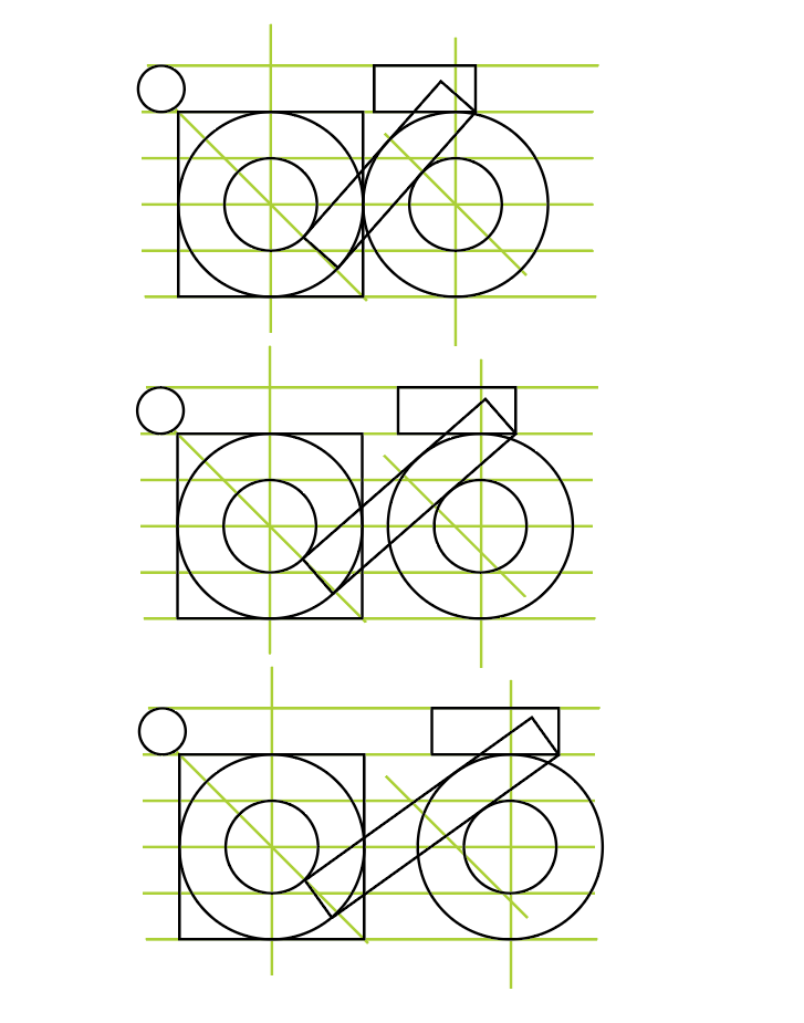
Below are views of some of the initial rework process and the internal structure which defines the angular relations and how the primary lines are replicate to build the letter forms.
A small shift in one area ripples and carries that angular adjustment outward. Understanding how branding visuals are built and relate across the brands use is a core skill.
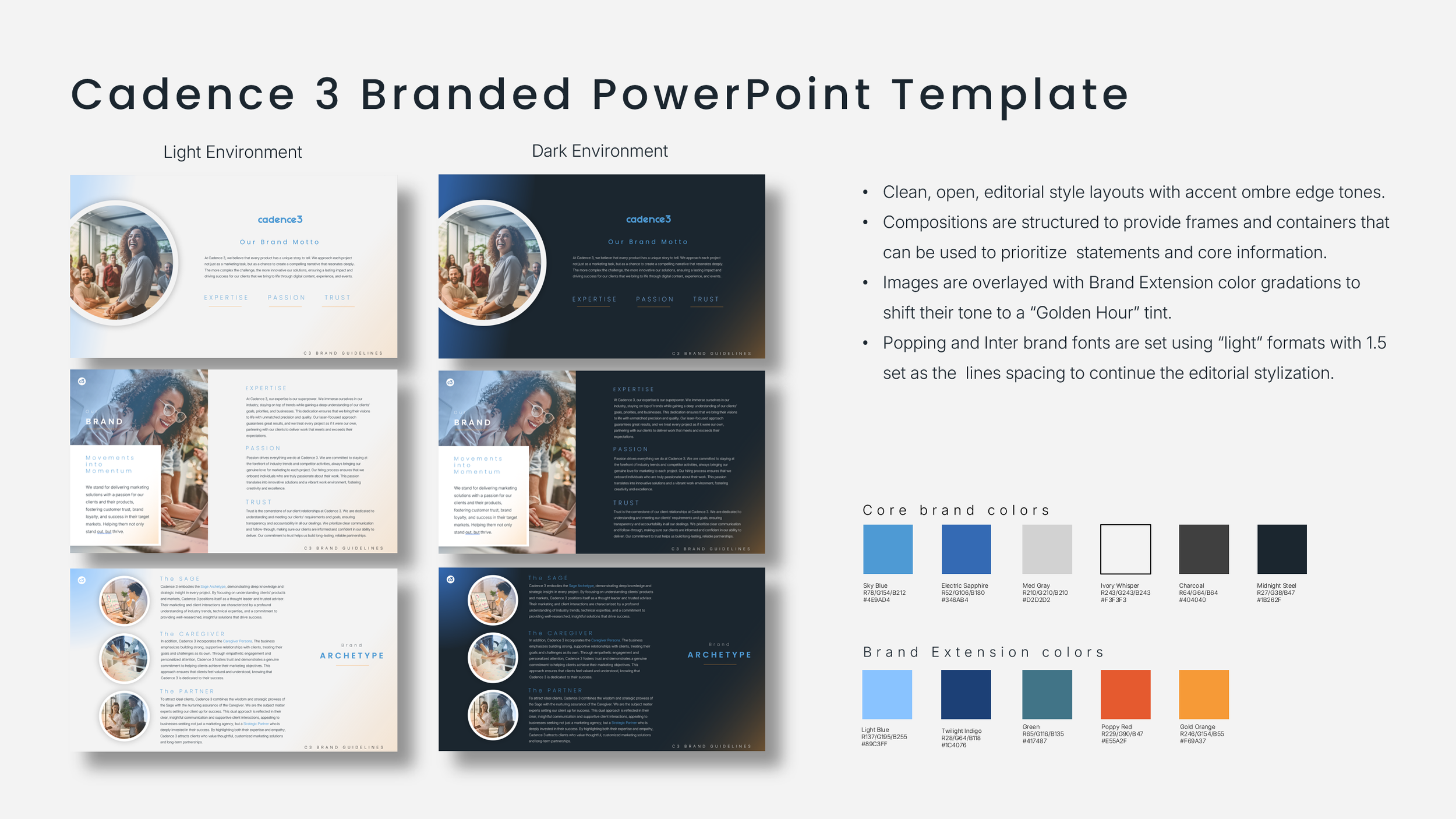
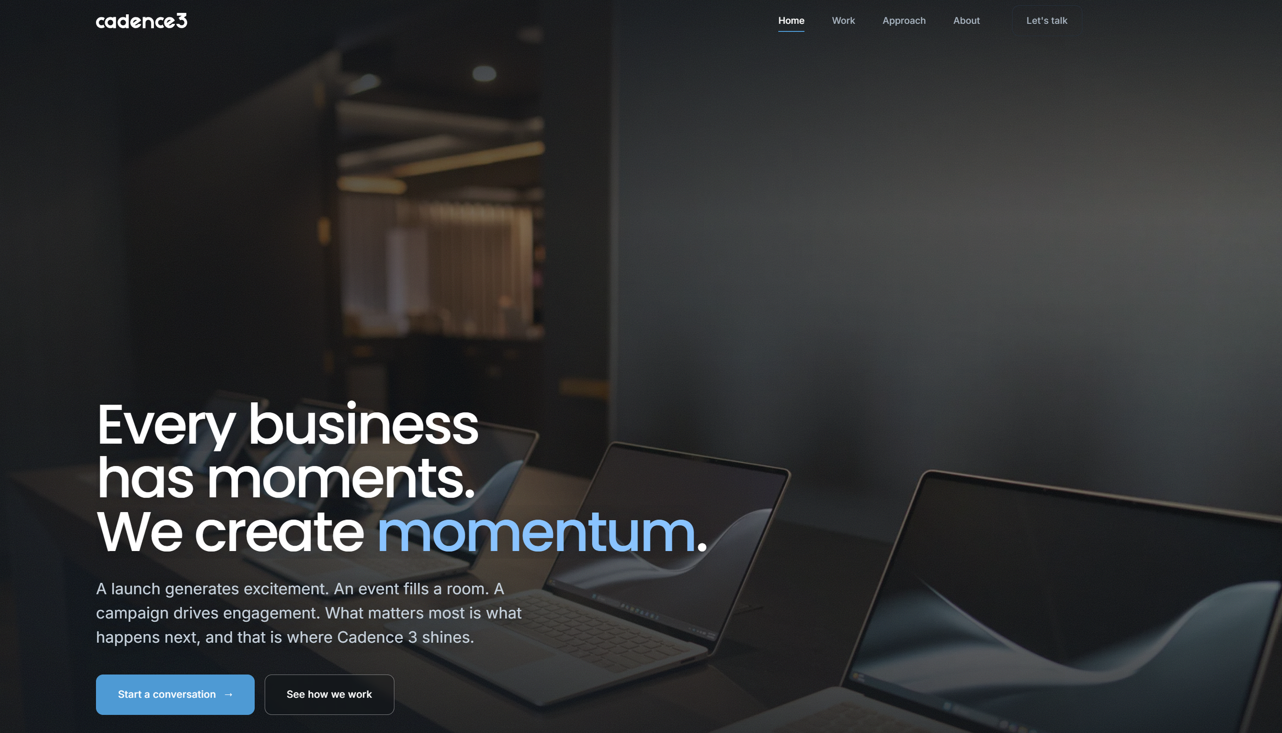
Once the logo was defined, a brand environment was established. The brand evolution was specifically developed to allow for further progressive steps in the brands overall positioning.